
Map Effect
So you wanna draw a map for your fantasy novel, huh? Why? What for?
That’s not an accusation at all, but rather a straight-up question. Not all fantasy maps are the same; they serve many different purposes, and that affects the mindset you need when you sit down to draw one.
What do you want to show your readers? How will you be using it? How will they be using it? Are you going to be referring to the map in your story, or is it there only for the readers’ use?
Of course, your map can do several things at once, in fact that would be preferable if you can manage it, but let’s go and explore a few ways that maps can and have been used to great effect in other stories.

Setting The Tone
It’s really easy to read up on drawing maps for fantasy books and feel overwhelmed by all the information you surely must pack into this seminal piece of literary work, so I wanted to start out on an easy one.
Sometimes maps are just there to look cool.
I know, that sounded a little heretical even in the privacy of my own head, but stay with me!
Maps aren’t just visual information, they are also works of art. Like illustrations, they add a lot to a story just on their own merit, and they can make a book a bit more interesting to people who get tired by pages and pages of text.

As a map, it’s not a complicated one. It’s got nothing to tell the onlooker that they wouldn’t have known from reading the books, there’s no extra towns or villages, and all of the places mentioned are shown in the text when the characters go and have adventures there.
One of the benefits of living in Oxford is that occasionally you get to go and see random paraphernalia from the Inklings’ early writing days, and I actually got to see C.S.Lewis’ notes to the lady who actually drew the map originally, Pauline Baynes. The instructions are all artistic in nature:
My idea was that the map should be more like a medieval map than an Ordnance Survey – mountains and castles drawn – perhaps winds blowing at the corners – and a few heraldic-looking ships, whales and dolphins in the sea.
And that’s perfect for the type of books that The Chronicles of Narnia are! They are a very medieval literature based series; in tone, in structure (if anyone’s interested I’ll talk about that more in another post) and in feel. And their maps reflect that.
People who love and remember the series will also love and remember the map because they go together so well. I mentioned I was doing this post to three people in two days and all of them had owned a poster of this map to put on the wall at home. As they should; it’s a beautiful map! Who cares if it’s not in any way necessary to enjoy the books? That map is beautiful, and we should rightly treasure it as such.
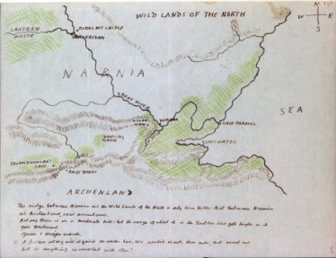
Bonus Section: Have you seen the sketch of the map that C.S. Lewis drew himself for reference when writing? This map always gives me hope when I’m struggling to draw a map to understand where to put things. Never look at the fancy ones that end up in the book and think that your own working copy has to look anything like as pretty, OK?
A Sense of Scale
If your characters are heading off on an epic quest, then a map can be a great way to show exactly how far these people are travelling. Books and films are wonderful, but between time-jumps and skipped dull areas, it’s hard to get a sense of how far is waaaay far.
Enter Middle Earth:

The great thing about The Lord of the Rings that I think people really respond to is the feeling that there’s far more going on in this world than we just see in the story. You know, like how Bristol still exists even though I haven’t been there in years. Or the fact that I’ve never seen Australia has no bearing on the fact that it’s really there and people live in it.
There are places on this map that our heroes never go to in the book; places like Dunland, Anfalas, or the Icebay of Forochel. There are places we already knew existed, but don’t see in this story, like Erebor and Mirkwood. And people in the story also come from those places, and they reference events going on in those places which we won’t get to see. The world of Middle Earth is effectively too big for the story to visit all of it, so some things can only be shown on the map and told of by other people.
You also get from the map a real sense of the scale of this adventure. In the event that you have an edition of the map which actually shows the Shire (some versions don’t and we’ll come back to that) then look at how far Frodo and Sam have to lug themselves and that lousy ring! Someone did a layover of the Middle Earth map and a map of the United States and effectively Frodo walks about two-thirds of the length of America to get rid of that thing. No wonder the book’s so long! That’s a lot of leg-work!
I know people who DNF the book and a lot of them tap out when Aragon, Legolas and Gimli are legging it across the Plains of Rohan, which yes, takes bloody forever.
But then you look at the actual size of the Plains of Rohan and all of a sudden you totally understand Eomer’s shock when they explain what they’ve just done and how he just thrusts two horses at the group of strangers because ‘I cannot deal with this kind of stupidity, for god’s sake just take them and I can stop worrying about your foolhardiness, who the hell let you three out and why isn’t there a responsible adult watching over you?’
I mean, I’m paraphrasing, but you know he was thinking exactly this.
Authenticity and Mystery
Sometimes, especially if everyone’s off on an adventure in your story, the map is vital for your reader because everyone in the story is looking at it, so you need to provide it for the reader.
Obviously I’m thinking of Thror’s Map in The Hobbit.
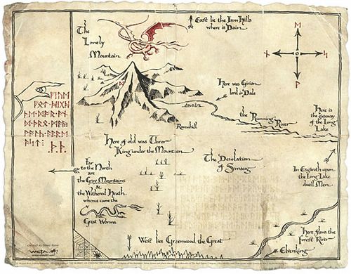
This map is a major plot device in the story, a rare case of a very well-used MacGuffin for those who read the Hide and Seek post. It sets everyone off on this crazy adventure and gives out information, but doesn’t over-stay its welcome or try to take over the plot. We don’t really care about the map or the treasure, after all, we just want to watch Bilbo and his dwarves getting into and out of trouble.
Anyway, the map is full of clues to help the gang on their quest, like the information on where the keyhole is, but it’s also really simple. There’s not a whole lot of information on it, like it’s just an aide-memoire for the kings of Erebor who need to pass along information about their home.
It’s a very … authentic map, really. It’s been made in-universe, by people our characters have a connection with, and it’s only been made for one purpose which it does really well. The map doesn’t show us where Erebor is in relation to much of anything, with the exception of a few arrows vaguely explain that To the North are The Grey Mountains and whatnot. But why should it? If you belong to Erebor then you will already know where Erebor is. I mean, we don’t when we read The Hobbit for the first time, but it’s not our map, so deal.
This also means the story can still have some big mysteries though, because the map not telling us everything is a problem for the characters too. The map assumes a certain level of knowledge which has been lost while the dwarves wandered, homeless after the mountain was taken. There are additional notes (the Moon Runes are written after the rest of the map, probably right before the map was given to Thror by his father) speaking to a need to pass down information about to be lost, but not everything was written.
Historians have this issue all the time, by the way. No one writes down everything because you’ll just know what they’re talking about, right? No, I don’t know what happened to cause the rift between these two houses and therefore starts this whole eighty years of conflict, tell me damnit!
Ahem.
So, yes. Asking yourself who made the map and why will mean that you may need to leave key bits of information out, and create a mystery about finding the answers. People make maps for all kinds of reasons, and those reasons will probably be different from our needs as readers and characters in this adventure. That’s just life, but that helps make your story feel like real life too.
Quick and Clear
Sometimes, especially if you’ve got a lot of information to get into the audience’s head in a very short space of time, you need to resort to big, easy to understand images, and maps are once again about to come to your rescue.
Take a look at the opening sequence of Avatar: The Last Airbender – there’s been a war going on for a hundred years, and there are four nations involved.
How do you explain who those four sides are and where they all are in relation to one another? That’s right; a map!
This beautiful, yet deceptively simple, map is shown at the start of every episode, and is referred to within the story too. The Fire Nation, we are told, has eradicated the Air Nomads, and largely crushed the Water Tribe, leaving only the Earth Kingdom left to be conquered. This is taking them some time, and the map certainly shows why that would be the case because the Earth Kingdom is massive.
Avatar is a children’s show, so there’s a lot of clean, clear images used. The map is easy to follow, and the use of colours is carried right through the show. The two characters from the Water Tribe wear blue, and their lands are picked out in blue on the map so you won’t forget where they come from. The Earth Kingdom is green, and so are the clothes worn by everyone belonging to the Earth Kingdom in the show, no matter who they are. Obviously the Fire Nation is red, and guess what their colour-scheme is?
There’s a lot of subtlety in the show, in its story, its characters and its world-building, but it can manage this without losing its intended audience because of these big simple over-arching images; the map and its colours keep everyone up to speed with who’s on screen at any one time, without having to remember what happened previously.
It’s tempting to over-complicate your map, along with everything else in your story, so if you keep losing your beta readers, check this show out and watch a master-class in when and where to keep things simple so you can play with subtlety elsewhere.
Developing Plotlines
Maps, like people and stories, don’t stay the same. They are constantly being redrawn and redrafted as ideas, styles, and politics shift and develop and change. If you’re writing an on-going series in which major events change the political or physical landscape of the world you’ve built, then why not experiment with showing those developments in the maps you draw?
Yes, obviously I’m talking about the opening sequence of Game of Thrones in which features a mechanical map: If you’re not familiar with the show, this is just the opening sequence so you can see what I’m talking about.

The way the show uses its opening sequence is very clever, as it only draws attention to the areas we’ll be visiting in this section of the story; showing where all these locations are in relation to each other, which faction controls each location and potentially telling us something about what’s going on there (like that whole time when Winterfell was on fire).
For such a large and detailed landscape, this cuts down on confusion – we’re never told anything we don’t need to know from the map, meaning everything we see is important – and it builds suspense for the areas we haven’t seen yet. People were really excited when Season Seven opened with the reveal of a new location after we’d become familiar with the old ones.
It also gives a sense of the rise and fall of various political powers as their emblems overtake or are overtaken on different strongholds, so you can track how each faction is doing without needing hours of plot explained to you.
In conclusion…
So as you can see, there’s a lot of different uses you can put your map to, so have a good think about what your maps can do for you. Obviously things change, as we’ll see later on in this little series, but that’s why we’re starting our sketching early!
As mentioned before, check out the Masterpost here for updates to my Many Adventures in Mapping, check out the rest of the Chronicles in Creation here for other writing topics and discussion pieces, and go for Ghosts&Gowns here for some original fiction which might tickle your funny bone!
Catch you next time, everyone!

I love the LOTR rings maps.
LikeLiked by 1 person
Me too! So much detail, and so big!
LikeLike
If more beginning authors drew a map of the areas they were writing about BEFORE actually writing, it might help them avoid some of the more egregious errors I have found. Like traveling the equivalent of 500miles in one day, on a horse 😀
Or travelling South for a week and to end up in the North Land.
LikeLiked by 2 people
Yes! This is exactly why I wanted to start drawing maps (shaky drawing skills aside) because otherwise the same journey that took three days when you have space to fill in the plot takes five hours later on because you’re in a hurry and this just… doesn’t physics at all!
And as I said before that whole *this country is vast and prosperous with many riches… and it has one town and one port in the whole thing.* Nope, not with you here!
LikeLiked by 1 person
😀
LikeLiked by 1 person
This has some great information! More than I can unpack in relation to my own work in one sitting. Bookmarking to return to later…
LikeLiked by 1 person
Great! I’m really glad you thought it was helpful, and thank you for such a kind comment!
LikeLike
You’re welcome! It’s a good reminder for me to approach ALL aspects of my worldbuilding as “drafts,” too, rather than worrying about making the build perfect before I can ever start writing. I tend to get bogged down in the planning stages if I let myself.
LikeLiked by 1 person
I like to get a lot sorted out, at least in principle before I start writing, I confess. But that’s mostly because I’m such a terrible editor that otherwise I miss inconsistencies until it’s too late and they drive me crazy!
Still, nothing is really set in stone ever, and the best way to see if something (while probably good enough) could work better in another way is to try it out and see!
Fear is useless and temporary! Drafts can be burned if necessary! It’s all good!
LikeLiked by 1 person
hehe yes a map can definitely just be used to look cool- and is always a welcome addition just for that! And you read my mind about showing distance 😉 Also yes to authenticity, plotting and mystery 🙂 Love all your examples!
LikeLiked by 1 person
This was so much fun to put together, I’m glad you liked it! There’s just something so exciting about looking at your bookshelevs and going ‘right, all fantasy maps, go!’
LikeLiked by 1 person